
Brand Design
The concept of the brand is based on the idea of a family as a core; everything and everyone is interconnected in it; which complements and empathize with each other.
It moves away from the standard perception of mead to originality, also maintaining the classic taste.
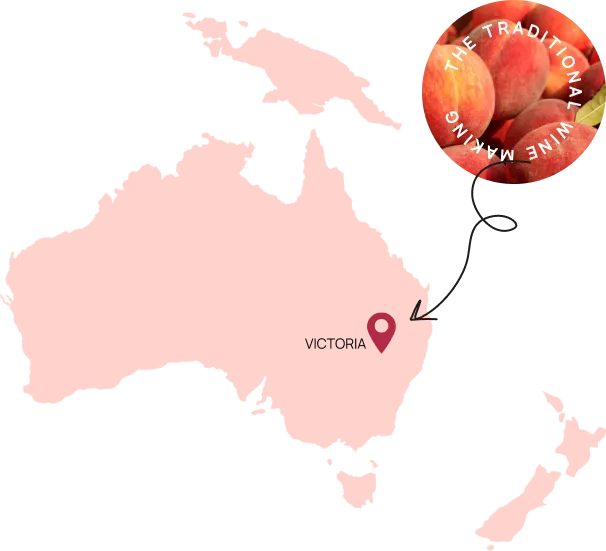
Peach plant originating from Bologna characterizes and highlights the entire visual design for the brand.
The solution is based on the structure of the mead, with all its features and unique multifaceted forms.

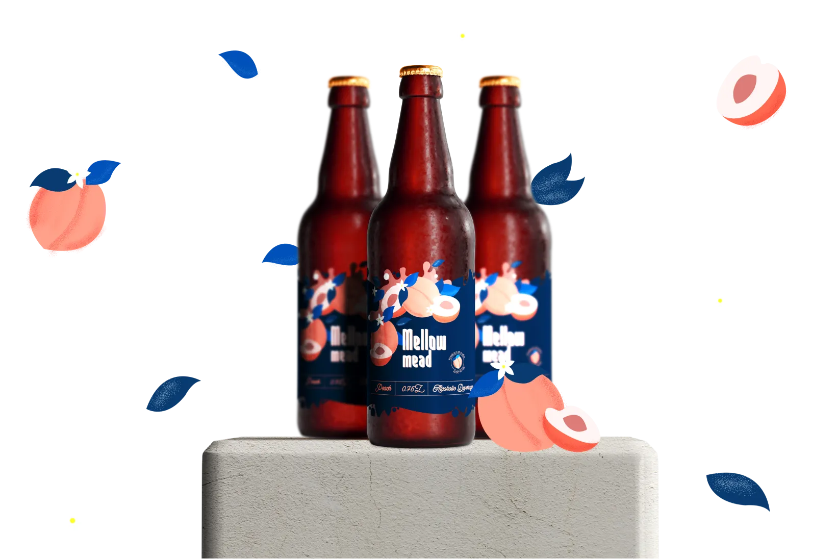
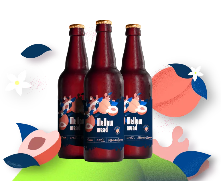
The color palette of this was derived from the natural colors of our main ingredient being peaches. Maintaining its contrast with the bottle and the label to look elegant and easily figurable to the audience.

The authenticity of the mead sets the main view of the logo. Saunder BRK was aa the main font. In the general dynamics of the label style, it stands out due to the static and stable form. This contrast helps to navigate the information parts of the label quickly and makes its reading easier.
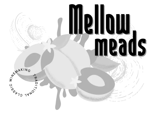

The illustrations reflect the freedom and originality of the exuberant fruit, which defy the general characteristics. For the main illustrations, the main ingredient forming the core taste was chosen which was peaches.
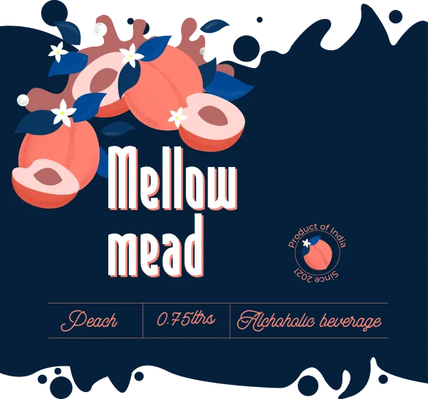

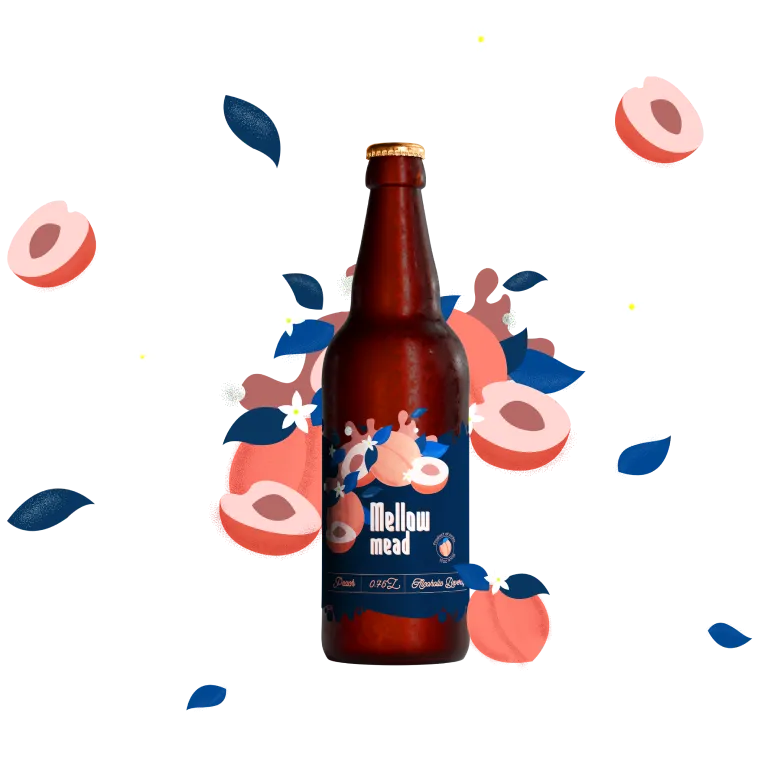
Bottles are designed based on the contrast of the bottle and a minimalistic label featuring brand illustrations and clear readable information about the product.
All the design elements are complementary and at the same time flexible to integration into the different types of visual language: brochures, posters and website interface.
Our Work
Other Projects

Branding & logo design • 2O22
Arora